 AnuUNMAINTAINED
Customization
Color
Anu uses HSL color format to define and use colors. You can update theme colors via themes configurations.
Below is the list of default colors. You can also add new colors to the palette.
Also checkout related documentation:
CSS variables
For the most part, Anu uses CSS variables for other stuff to providing maximum flexibility and customization on the fly. All anu's CSS variables are prefixed with a-.
View all CSS vars
Below is CSS vars defined for preset theme default's light theme:
--a-base-c: var(--a-primary-hue), 10%, 20%;

--a-spacing: 1;

// ℹ️ Represents theme color. light => white, dark => black. ATM, it's used for backdrop & badge outline color.
--a-theme-c: 0, 0%, 100%;

--a-border-opacity: 0.12;
--a-loader-overlay-bg-c: var(--a-theme-c);
--a-loader-overlay-bg-opacity: 0.85;

--a-backdrop-c: 0, 0%, 0%;
--a-backdrop-opacity: 0.35;

// text emphasis
--a-text-emphasis-high-opacity: 0.87;
--a-text-emphasis-medium-opacity: 0.68;
--a-text-emphasis-light-opacity: 0.38;

// Typography
--a-title-c: var(--a-base-c);
--a-subtitle-c: var(--a-base-c);
--a-title-opacity: var(--a-text-emphasis-high-opacity);
--a-subtitle-opacity: var(--a-text-emphasis-light-opacity);

// SECTION Components

// 👉 Card
--a-card-spacer: 1em;
--a-card-padding: 1.25em;

// 👉 Spinner
--a-spinner-size: 1.25em;

// 👉 Switch
--a-switch-track-size: 3em;
--a-switch-thumb-margin: .25em;
--a-switch-default-color: 220, 13%, 91%;
/*
  ℹ️ Value of this property is => hsla(var(--a-base-c), var(--a-text-emphasis-medium-opacity)).
  As this will be always on light background we will keep it static and choose color from light scheme
*/
--a-switch-icon-color: hsla(0, 10%, 20%, 0.68);

--a-tooltip-bg-c: 0,0%,8%;
Moreover, It's recommended that you learn CSS vars naming convention for color to know when you should wrap hsl() or use CSS var directly.
Additionally, theme can also add CSS variables based on the theme.
Component customization
All the UI configurable styles are applied using theme preset. If you have noticed in installation section there's a preset called presetThemeDefault.
presetThemeDefault have various shortcuts that styles the component. You can override these shortcuts to change the look & feel of the component.
To override those shortcuts use shortcutOverrides option as shown below:
presetThemeDefault({
  shortcutOverrides: {
    btn: 'px-[0.75em] py-[0.375em] rounded-[0.375em] gap-x-[0.375em] whitespace-nowrap',
  },
})
Guess, how our button will look like?
View answer
It's a bootstrap button 🤯
Just change the colors to Bootstrap's color and see the magic 😍 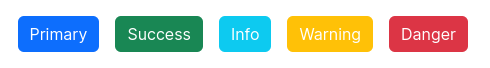
You can refer to available shortcuts in this file.
If you like this simple customization don't forget to give a star on Github. If you don't like it give a triple star 😉.
INFO
Don't forget to checkout theme documentation to learn more about theme customization.