 AnuUNMAINTAINED
Presets
Introduction
Apart from theming just colors, Anu also gives full flexibility on customizing the components. Anu allows defining your own preset that changes how components should look.
With presets feature, You can even replicate Bootstrap or Material design
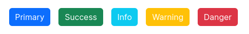
Below is an example of buttons customized using preset feature to look like Bootstrap buttons:
If you had noticed in the installation section, to use Anu you need to use two presets.
- Anu (
presetAnu) - Theme Default (
presetThemeDefault)
presetAnu provides core styles for Anu. These styles have nothing to do with visuals of any component.
presetThemeDefault is where all the styling magic happens.
INFO
Actually, presets feature is from UnoCSS. Anu leverages this to provide component styles in separate preset so you can customize the framework however you like.
How to customize the theme default preset?
To change the look of a single component, you don't have to create the preset from scratch or copy-paste the existing preset.
presetThemeDefault have various shortcuts that styles the component. You can override these shortcuts to change the look & feel of the component.
presetThemeDefault({
  shortcutOverrides: {
    btn: 'px-[0.75em] py-[0.375em] rounded-[0.375em] gap-x-[0.375em] whitespace-nowrap',
  },
})
How to create your own preset?
Creating your own UnoCSS preset is really simple. We recommend you first checkout the UnoCSS documentation on presets.
Next, you can refer to our presetThemeDefault preset to create you own preset.
If you want more details, feel free to let us know that you are building your own preset so we can focus more on this part of documentation.