 AnuUNMAINTAINED
Card
Basic
Card component uses ATypography component for its typography.
Moreover, you can also use .card-body in default slot to render card content.
You can use .card-spacer helper class to add margin bottom to each of its children except last.
Card title
Chocolate cake tiramisu donut
Ice cream sweet pie pie dessert sweet danish. Jelly jelly beans cupcake jelly-o chocolate bonbon chocolate bar.
Card title
Chocolate cake tiramisu donut
Ice cream sweet pie pie dessert sweet danish. Jelly jelly beans cupcake jelly-o chocolate bonbon chocolate bar.
Card text font size
If you pass text prop directly on ACard then ACard will add text-sm class before passing down it to ATypography. Hence, when you don't use text prop and manually write text as show in second card, for small text you have to add text-sm class.
This way if you want 16px font for your card text instead of 14px you can omit adding text-sm to p tag;
Adjusting card body padding
You can adjust the padding to applied by a-card-body using --a-card-padding CSS variable.
Adjusting card spacer margin
You can customize the applied margin-bottom by configuring --a-card-spacer CSS variable.
Various Elements
Mix and match the different components to achieve desired UI.
Card title
Chocolate cake tiramisu donut

Macaroon cake powder pie cake cake gingerbread oat cake chocolate cake.

Card title
Chocolate cake tiramisu donut
Ice cream sweet pie pie dessert sweet danish. Jelly jelly beans cupcake jelly-o chocolate bonbon chocolate bar.
Awesome mobile
Biscuit liquorice apple pie candy canes
Donut jelly beans cake lollipop sweet biscuit. Pie apple pie powder apple pie gummi bears. Jelly apple pie croissant candy canes liquorice halvah.
Variants
Card component uses layer composable as it's base. You can use variant prop to create various card variants.
Card title
Chocolate cake tiramisu donut
Ice cream sweet pie pie dessert sweet danish. Jelly jelly beans cupcake jelly-o chocolate bonbon chocolate bar.
Card title
Chocolate cake tiramisu donut
Ice cream sweet pie pie dessert sweet danish. Jelly jelly beans cupcake jelly-o chocolate bonbon chocolate bar.
Card title
Chocolate cake tiramisu donut
Ice cream sweet pie pie dessert sweet danish. Jelly jelly beans cupcake jelly-o chocolate bonbon chocolate bar.
Card title
Chocolate cake tiramisu donut
Ice cream sweet pie pie dessert sweet danish. Jelly jelly beans cupcake jelly-o chocolate bonbon chocolate bar.
Slot
You can use ATypography slots to render custom content in header.
Chocolate cake tiramisu donut
Ice cream sweet pie pie dessert sweet danish. Jelly jelly beans cupcake jelly-o chocolate bonbon chocolate bar.
Chocolate cake tiramisu donut
Ice cream sweet pie pie dessert sweet danish. Jelly jelly beans cupcake jelly-o chocolate bonbon chocolate bar.
TIP
Above demo adds content to the right of title. If you want to add content on the right of both title & subtitle use header-right slot.
API
Layer variant
Interaction states like hover & active
Set loading state
Tag to use for title of the component
Tag to use for subtitle of the component
Tag to use for text rendered via text prop
Typography text content
Layer color
Typography title
Typography subtitle
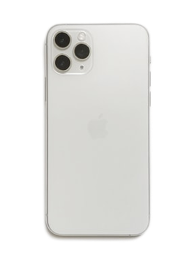
Render image at the top of the card (above header)
alt attribute for image rendered via img prop